is minimalism actually good?
- PATH
- /posts/is-minimalism-actually-good.md
- MODE
- READ ONLY
- TYPE
- MARKDOWN
- WORDS
- 316
My Website
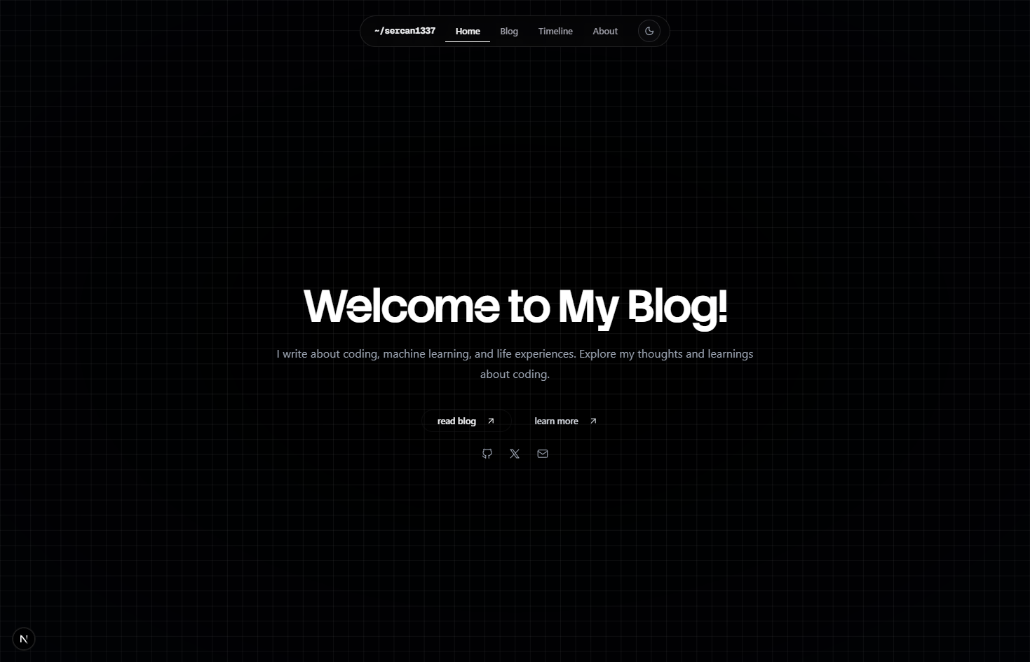
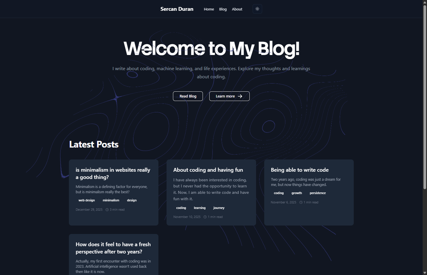
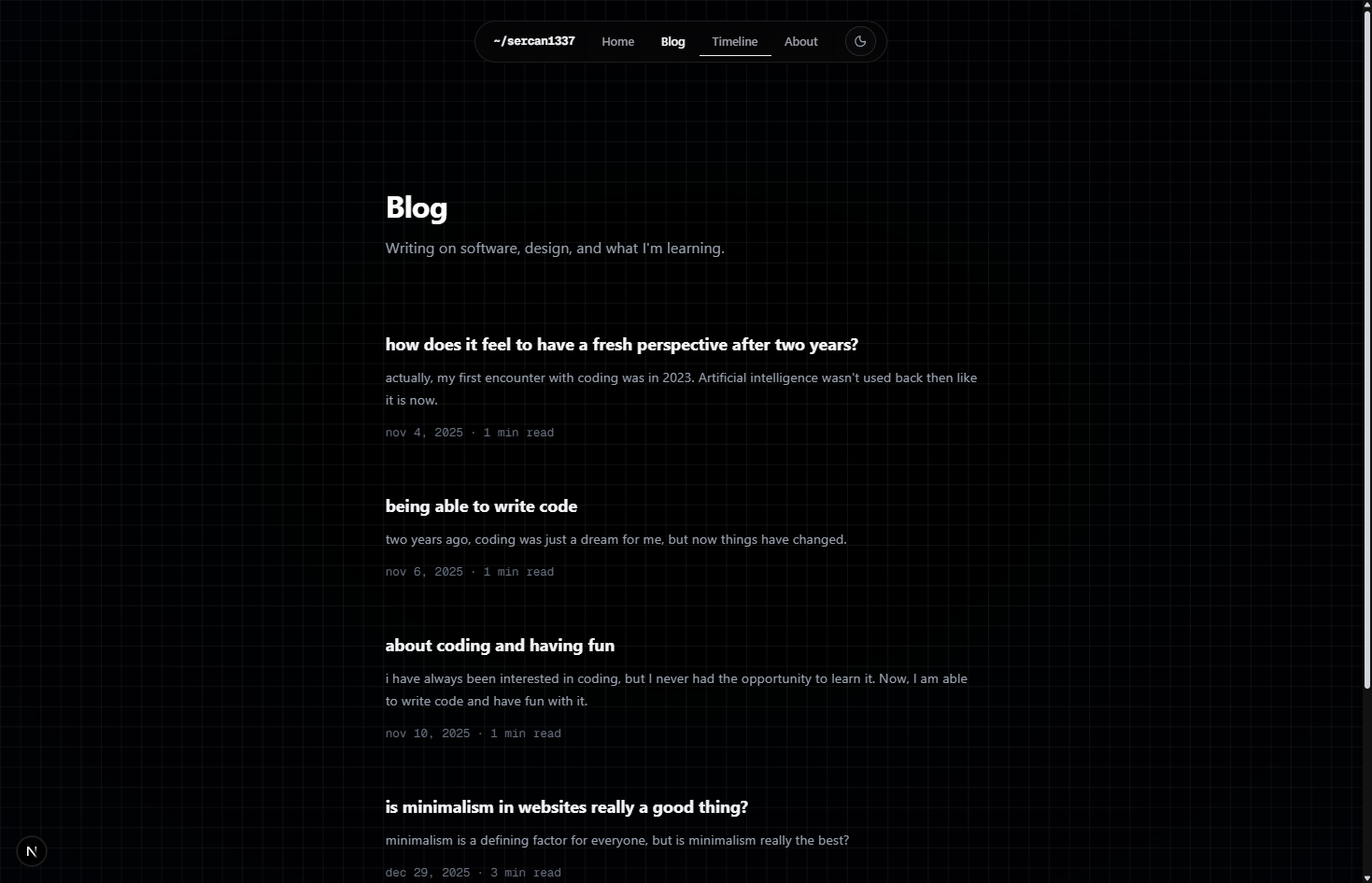
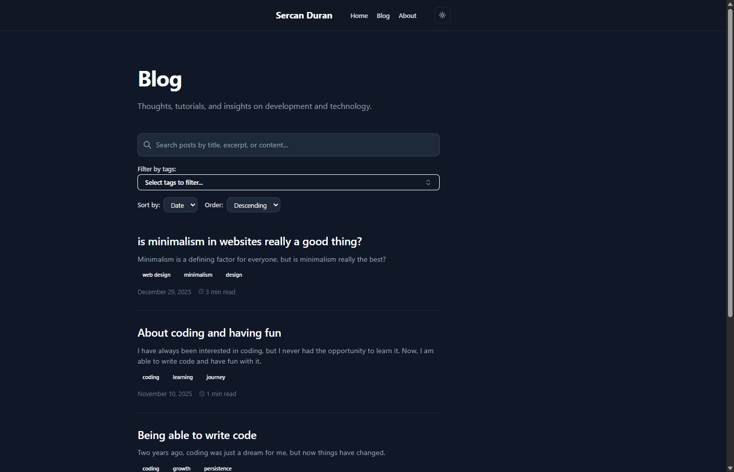
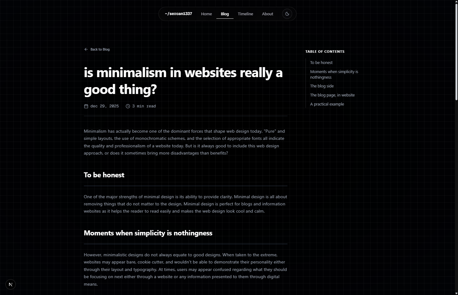
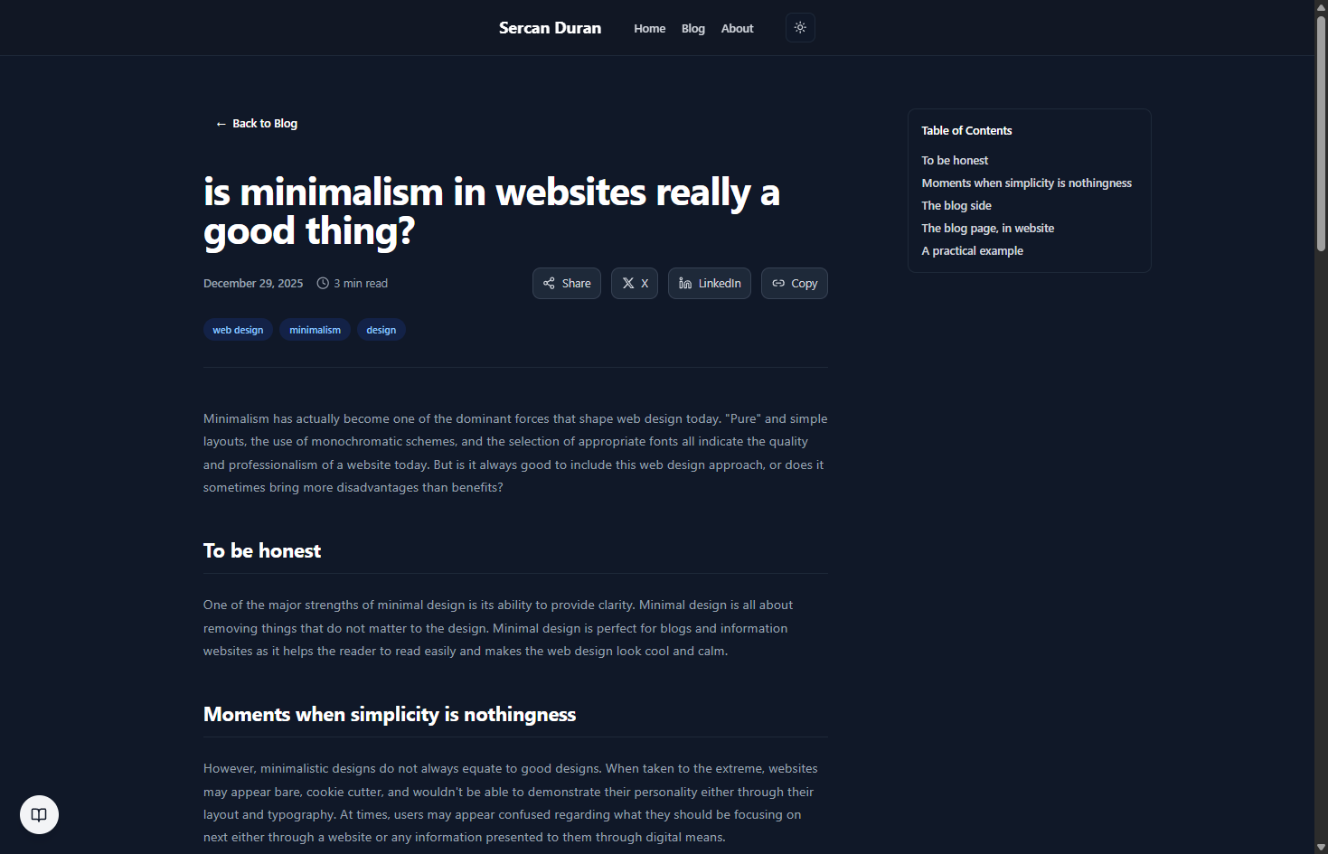
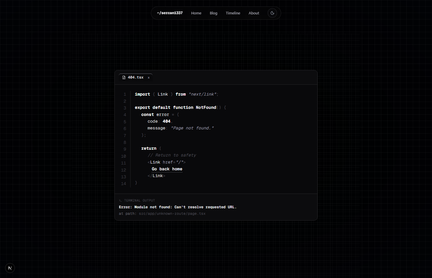
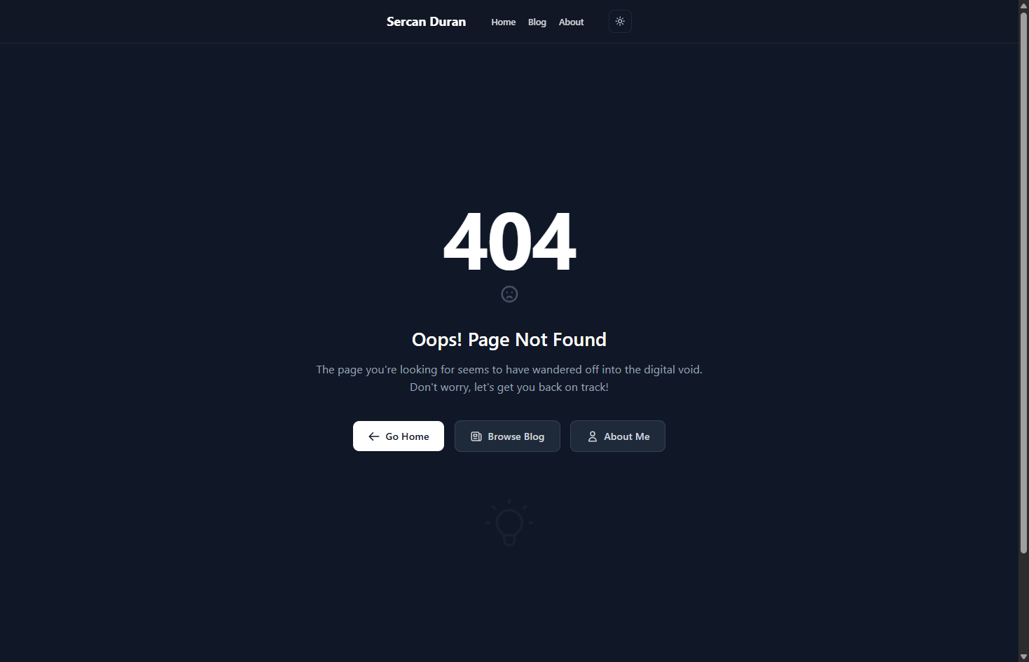
in a previous post, i asked "is minimalism in websites really a good thing?" and explored the concept of minimalism in the digital world. back then, i was just pondering an idea, but today, it was time to put those thoughts into practice.
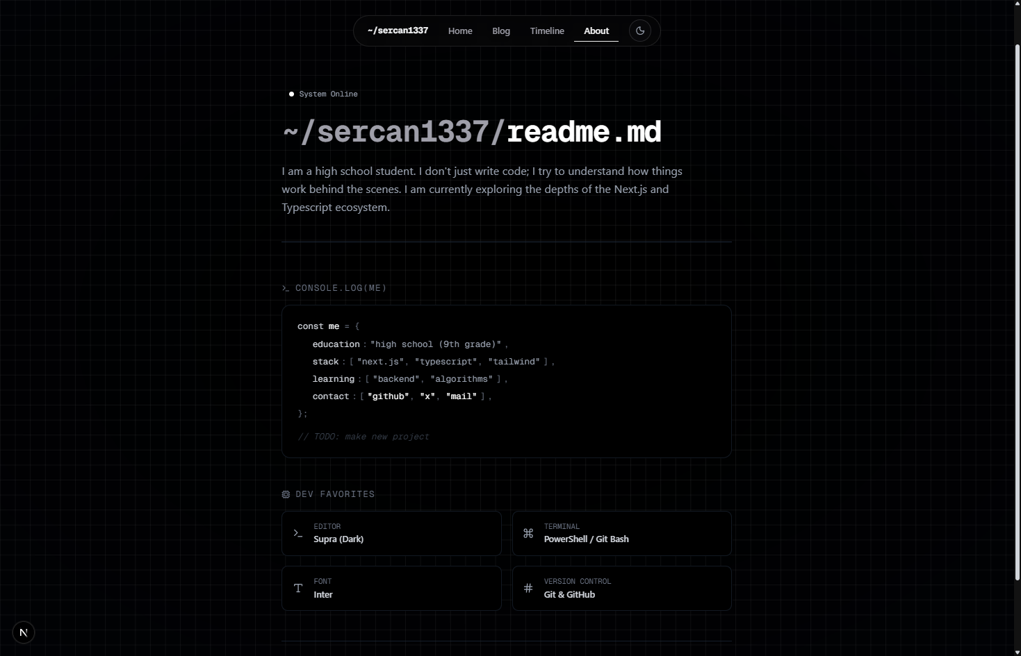
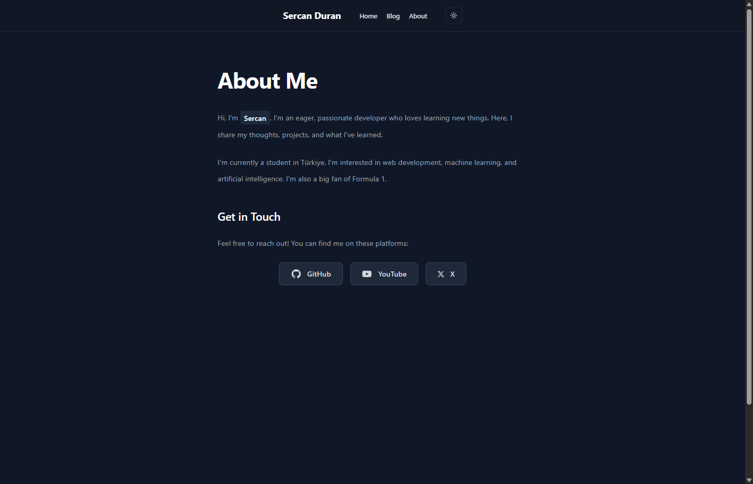
with the recent significant changes i've made to my website, i've tried to make the "less is more" philosophy not just a visual preference, but a core part of the user experience. i realized that a portfolio shouldn't just be a list of skills; it should be a reflection of how i think and build.
what exactly changed?
the layout: i moved away from crowded grids. i wanted more white space (or dark space, in my case) to let the content breathe. every pixel now has a reason to be there.
typography & readability: i refined the fonts and spacing. reading a blog post or looking at a project should feel effortless, not like a chore for your eyes.
performance: minimalism isn't just about looks; it's about code. i cleaned up unnecessary components and optimized the loading states. the result? a much faster, snappier experience.
the "why": i removed elements that were just there for "show" and focused on what matters—my journey, my code, and my learning process.
finding the balance
this update is my current answer to the question "is minimalism actually good?" i've learned that it's not about having nothing on the screen; it's about having exactly what is needed. sometimes, to make something better, you need to take things out rather than add to them.
before/after